Keys to a Client-Winning Financial Advisor Landing Page
Published :
Last change : 01/10/2026
Table of contents
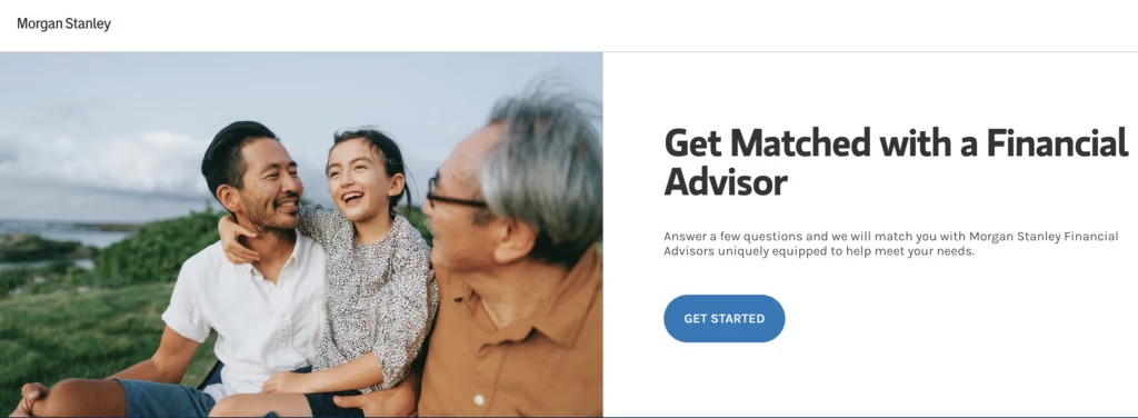
Even though Morgan Stanley’s copy could be much stronger, their hero image is excellent for a financial advisor page: a high-quality scene of family, legacy, nature, joy, and calm.
As a bonus, it sits on the left, leaving the right side free for the page title and main call-to-action, which is ideal for a landing page layout.
Want to Stand Out as a Financial Advisor? Explain the Value You Bring to Clients
Lead with the Value, Not the Job Title
When someone lands on your page, they already know you are some kind of financial advisor.
“Financial Advisor”, “CFP®” or “Wealth Manager” does not answer the only question they actually care about:
=> “What can you do for someone like me?”
Your main headline should spell out the specific outcome you help a specific type of person achieve, not just what you are.
Instead of: “John Martin – Financial Advisor”
think more like:
“Turn Your 50s Savings into a Clear Retirement Income Plan”
“Help Business Owners Turn a Company Sale into Long-Term Security”
“Build a Simple, Tax-Efficient Plan for Your Family’s Future”
Evergreen doesn’t shout its job title above the fold. It leads with a plain-English promise and lets the “tax strategy” label play a supporting role. That’s exactly how you stand out as a financial advisor.
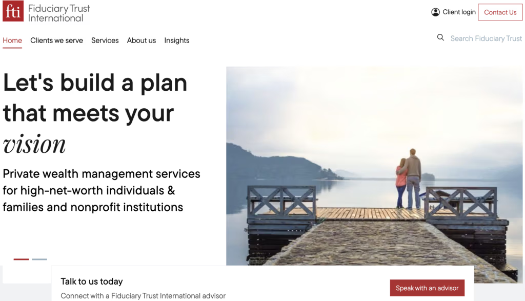
Same thing with Fiduciary Trust International: they lead with a clear promise “Let’s build a plan that meets your vision” and keep “Private wealth management services for high-net-worth individuals & families and nonprofit institutions” as a supporting line.
The value proposition is what dominates the screen; the job label just backs it up.
You Can Be Bold Without Being Misleading
Being in a regulated industry doesn’t mean your copy has to sound dead.
It just means you have to be precise.
The line you must not cross is promising results you can’t control (“we will beat the market”, “we guarantee X% returns”).
But you can still be bold about:
Who you help
What situations you specialize in
What your process is designed to achieve
Instead of this
You can safely say things like
We provide personalized financial advice
We help tech employees turn stock options into a real-life plan
We help you reach your goals
We focus on helping business owners turn a company sale into long-term security
Our process is built to give you a clear, tax-efficient retirement income plan
The goal is not to sound aggressive.
The goal is to avoid the empty, forgettable lines like “Private Wealth Management” and replace them with concrete, believable outcomes that a real person can understand and remember.
In This Market, Standing Out Is Surprisingly Easy
The good news: in financial advisory, your competition is doing you a favor.
Most firms’ “message” is just a label:
“Private Wealth Management”
“Comprehensive Financial Planning”
“Personalized Advice for Individuals and Families”
If you spend five minutes clicking through advisor websites, you’ll notice two things:
Everyone sounds the same.
Almost nobody clearly says who they’re for or what specific problem they’re built to solve.
In a market where most advisors hide behind generic labels, simply stating a clear audience and a clear outcome already makes you look different, more thoughtful, and more relevant.
Make Your Value Impossible to Miss at First Glance
Most advisor pages waste the first few seconds on a big photo and a vague line.
Those seconds decide if people stay or leave.
Your job is simple:
In 3–5 seconds, a visitor should understand who you’re for and what you can help them achieve.
That means your value proposition must sit front and center, not buried:.
In practice, that usually means:
In the main headline, not a paragraph lower on the page
Backed up by a short subheadline that adds one key detail
With a clear button right next to it that says what happens next
For example:
Headline: “Turn Your 50s Savings into a Clear Retirement Income Plan”
Subheadline: “CFP® Wealth Manager based in Chicago, working with professionals in their 50s.”
Button: “Book a 20-Minute Retirement Call”
If someone has to scroll, squint, or read a full paragraph to understand your value, you’ve already lost a good share of visitors.
Make it so that even a half-distracted visitor can glance at the top of your page and say:
“Okay, this is for people like me, and I see what they can help me with.”
2) making sure it’s the most visible element on the page, and
3) using a hero image on the right that clearly illustrates and supports that promise.
Bonus: the people in the picture are looking toward the value proposition, subtly inviting the visitor to do the same.
Help Visitors Feel Safe and Understood
Acknowledge How Money Actually Feels
Most advisor pages talk as if money were a purely rational topic.
Your visitors don’t experience it that way at all.
For many people, money feels like:
A constant low-level worry in the background
A mix of guilt (“I should have done this earlier”) and fear (“What if I mess this up?”)
Something they know they should address, but keep postponing
If you ignore that emotional reality, your page sounds cold and distant.
If you name it, you instantly feel more human and on their side.
You don’t need a full paragraph of drama.
One or two simple lines near the top can be enough, for example:
“Maybe you’ve been meaning to sort this out for a while, but it always feels too big to start.”
“You’ve worked hard for what you have. The idea of making a mistake with it is scary.”
“If money has been a nagging source of stress, you’re not the only one.”
You’re not selling here, you’re just describing how it already feels for them.
That small gesture says:
“We see you. You’re not weird. You’re not alone.”
Only after that does your logical value proposition really land.
Northern Trust gets that prospects don’t move on logic alone. Their message speaks to both the rational side of the decision and the emotions that come with big financial choices.
Put a Human Face on Your Advice
People don’t talk to “a firm”. They talk to a person.
Your page should make it obvious who they’ll be talking to.
That means:
Show real photos of you (and your team if relevant), not just buildings, skylines, or stock images of “happy retirees”.
Use shots where you look approachable and normal: sitting at a desk, in a meeting room, maybe in your actual city – not stiff, arms-crossed corporate poses only.
If you’re comfortable with video, a simple 60–90 second clip can go a long way:
Look into the camera.
Say who you are, who you help, and what happens on a first call.
Speak like you would to a real person, not like you’re reading a brochure.
The goal isn’t to impress.
The goal is for a nervous visitor to look at your page and think:
“Okay, this is a real person. I can imagine myself talking to them.”
This Cresset video has a double benefit: it strips jargon from concepts like “family office” and, by showing real people, makes the firm feel approachable enough for a qualified visitor to start a conversation.
Use Conversational Language, Not Jargon
If your page reads like a prospectus, people will shut down before they even reach your form.
Remember: most visitors are smart, but they don’t live in your vocabulary.
Phrases like:
“holistic wealth management solutions”
“optimized capital allocation”
“comprehensive planning across all domains”
Don’t make them feel safe. They make them feel stupid or bored.
A simple rule: Write like you talk in a first meeting with a non-financial friend you respect.
Use “you” and “we”, not abstract phrases
“We’ll look at everything you already have and show you where you stand today.”
“You’ll leave with a clear list of next steps.”
Swapjargon for normal words:
Instead of this
Choose this
allocation
how your money is invested
decumulation
how you’ll spend your money in retirement
downside protection
what happens if markets fall
Prefer short, direct sentences:
Instead of this
Choose this
Our objective is to deliver personalized, goal-based solutions tailored to your unique needs
We build a simple plan based on what you want your money to do
You’re not trying to impress another advisor.
You’re trying to make a worried, busy person think:
“Okay, I understand what they’re saying. I can ask questions here without feeling dumb.”
That feeling of “I can talk to these people” is more powerful than any technical paragraph.
Be Realistic: Don’t Aim for a Client, Aim for a Conversation with the Right People
Just Aim for a Conversation with a Qualified Prospect
On this landing page, your goal is not to “win a new client”.
That’s too big, too soon, and it pushes you to oversell.
Be more realistic: The real job of the page is to get a qualified prospect to talk to you.
A “win” for this page is simple:
They book a short call
Or they request a check-up / second opinion
Or they fill a short “see if we’re a fit” form that leads to a call
That’s it.
Measure success in conversations started with the right people, not in clients signed or assets moved. Those come later, through your process, not from one page view.
When you write or review your landing page, ask:
“Does this make it easier for the right kind of person to say:
‘Okay, I’ll talk to them’?”
If the answer is yes, the page is doing its job.
Be Clear on Who Counts as “Qualified”
If your goal is “a conversation with a qualified prospect”, you have to decide: “Qualified for this page means who, exactly?”.
Most advisors skip this step and write for “anyone with money”.
Result: you attract people who are too early, too small, or have the wrong problem.
Define “qualified” in simple, concrete terms:
Life stage: e.g. “professionals in their 40s and 50s”, “approaching or in retirement”
Situation: e.g. “sold or planning to sell a business”, “receiving an inheritance”, “high earners, new to investing”
Rough financial level: e.g. “at least $X in investable assets” (you can use ranges)
Main concern: e.g. “turning savings into income”, “what happens after a company sale”, “not sure if they can retire”
The landing page is there to make it easy for the right people to raise their hand—and for the others to realize this page isn’t for them.
Stash Wealth makes it very clear who it’s for: people in their thirties.
Make the First Step Feel Safe
Even a “simple” call with a financial advisor feels risky from the visitor’s side:
“Are they going to push me to move my money?”
“Is this going to be an hour-long sales pitch?”
“Do I need to prepare documents I don’t have?”
Your job is to remove that fear in how you frame the first step.
Be explicit about three things:
What it is
“A 20-minute call to understand your situation and answer your first questions.”
“A quick retirement check-up to see where you stand today.”
What they need to do
“No documents needed for this first call.”
“You don’t have to have everything figured out—just bring your questions.”
What will not happen
“No obligation, no pressure to become a client.”
“We won’t ask for any account numbers or sensitive details.”
Put one or two of these lines right next to your main CTA or form, for example:
“Takes 20 minutes. No documents needed. No obligation.”
And make sure your form matches that promise:
Only ask for what you really need to follow up (name, email, phone, maybe one simple question).
Save detailed questions for later.
A first step that feels small, clear, and safe is a first step people actually take.
Design the Whole Page to Lead to That Conversation
a Landing page is not a Homepage
Your homepage has to do too many jobs at once:
Speak to existing clients
Present all your services
Tell your story
Link to every important section of the site
A landing page (LP) shouldn’t try to do any of that.
A landing page exists for one reason: turn the right visitor from “just looking” into “willing to talk”.
That means it does notneed:
Full navigation with 7–10 menu items
A long list of every service you offer
A full “About the firm” section
Blog links, resources, careers, news, etc.
All of those things give people places to wander instead of taking the next step.
Here’s a concrete example to show the difference between a homepage and a landing page.
Above is Fisher Investments’ homepage: it offers many internal and external links and a search bar, giving you multiple ways to leave this page and go see exactly what you want to see which is precisely the role of a homepage.
Now, still on Fisher Investments’ website, this landing page does the opposite: it deliberately removes distractions so the visitor can focus on the targeted next step: either downloading a brochure or reaching out to the company.
Use One Clear, Conversation-Starting Call-to-Action Everywhere
If your goal is one thing — start a conversation with the right people — your buttons should stop pretending otherwise.
On most advisor pages you see:
“Learn more”
“Contact us”
“Get started”
“Submit”
All on the same screen.
Result: nobody is quite sure what happens next.
Your landing page should have one main action and one main sentence for it, repeated everywhere.
In practice:
Pick the exact wording of the main step:
“Book a 20-Minute Call”
“Request Your Retirement Check-Up”
“Ask for a Second Opinion”
Use that same sentence (or a very close version) on:
The main button in the hero
The button under your key benefits
The button near the bottom of the page
The button next to your form
If the action is “book a call”, the button should literally say “Book a 20-Minute Call”, not make the visitor guess.
A good example of a low-pressure, conversation-first CTA: Aspiriant simply invites visitors to “Start a dialogue” instead of “Get Started” or “Submit”
Make Your Layout and Design Serve the Unique Goal
Good layout is not about “looking modern”.
It’s about making the next step (start a conversation) feel obvious and easy.
Think of your design as a sequence that quietly says:
You’re in the right place
This makes sense
You can talk to us
A few practical rules:
a) Use visual hierarchy to guide the eye
Make it easy to skim:
Big, clear headings for each section
Short paragraphs and bullet points
Key phrases in bold where it helps
A scrolling visitor should be able to pick up:
What you do
Who it’s for
What the first step is
without reading every word.
b) Keep the form and Call-to-Action (CTA) visually “reachable”
Don’t hide the action:
Show the form or booking link near the top
Repeat a CTA after your main proof / benefits
Add another CTA near the bottom for people who read everything
On mobile, make sure:
The CTA button is easy to tap
The form isn’t squeezed into a tiny column
Visitors don’t have to scroll forever to find where to contact you
Even though the call-to-action wording could clearly be improved, Savant Wealth made sure it’s always within reach—a sticky CTA visible everywhere on the page, on both desktop and mobile
c) Make the page feel calm, not crowded
Too many fonts, colors, and boxes create noise.
Stick to a simple color palette
Leave enough white space around important elements
Avoid walls of text and over-decorated sections
The layout should give the impression that you’re organized and thoughtful, which is exactly what they want from someone touching their money.
Remove Anything That Might Distract from Reaching the Main Goal
On a landing page, anything that doesn’t help a qualified person start a conversation is a distraction.
Every extra link is an exit door.
Every extra option is a reason to “come back later” (they won’t).
Ask of each element on the page: “Does this make it more likely that the right person will book a call or reach out?”
If the answer is no, it should go.
a) Cut “explore the site” behavior
Things that usually pull visitors away from the main step:
Full navigation with 6–10 menu items
Links to blog, resources, careers, news, events
A big “Read our latest article” banner
Those belong on your homepage, not on an ad landing page.
b) Don’t Send Visitors Away with Social Icons
Social icons in the header are classic conversion killers:
People click “LinkedIn” or “Instagram”
Get lost in notifications and feeds
Never come back
If you want to show you exist on social:
Put icons small, in the footer
Or mention “Follow us on LinkedIn” lower on the page
But don’t let social links sit right next to your main CTA.
For an illustration of how to remove distractions on a landing page so the visitor can focus on the main goal, compare the footers of Fisher Investments’ homepage and one of their landing pages (see above).
On the homepage footer, you have more than 30 links to other pages both on and off the website.
On the landing page footer, it’s the opposite: almost no links at all. The only links left are either for privacy information (which is necessary in such a sensitive industry) or to the contact form.
c) Keep popups and widgets under control
Things that also break the flow:
Aggressive exit popups
Live chat opening automatically
Cookie banners that cover your CTA on mobile
If you use chat, let it sit quietly in the corner.
Keep the Door Open for Other Channels
Choosing one primary action doesn’t mean forcing everyone through a form.
Yes, your landing page should clearly push one main step. That’s what your headline, layout, and main CTA are built around.
But in real life, people have preferences:
Some hate forms and would rather call.
Some want to send an email they can think about.
Some feel safer starting with chat.
If a visitor lands on your page and then decides to call, email, or start a chat, that’s still a success:
they went from “anonymous visitor” to real conversation.
The key is to:
Make the main action visually dominant
Big button, clear form, repeated in key spots
Offer other channels quietly, without competing for attention
Phone and email written near the form: “Prefer to reach out directly? Call XXX or email YYY.”
Chat icon sitting in the corner, not popping over your CTA
You stay disciplined around one primary path, but you don’t block people who are ready to talk, just not in the exact way you originally planned.
Even though Fisher Investments’ main goal is to get you to download a guide—so they can capture your email and start building trust—they still offer other ways to connect, like calling them directly or writing to them.
Make It Easy for Visitors to Trust You
Storytelling: Why You Do What You Do
A short story on your personal journey can definitely help build trust.
In 3–6 sentences, answer:
Why this work matters to you
“I saw my parents retire without a clear plan…”
“I used to work in big banks and wanted more direct impact…”
Why you chose this type of client
“Most of my clients are professionals in their 40s and 50s who feel they started ‘too late’.”
What you want for them
“My goal is to help you make decisions you actually feel calm about.”
Even though the layout could be better, this section from Clarity Financial is a great example of how storytelling can help build trust
Let Prospects Hear from People Like Them
Short, specific testimonials do more than any generic slogan.
Aim for:
Real names (or at least initials + city, if compliance is strict)
Real situations
Real outcomes in plain language
A human, genuine video like this on your landing page would almost certainly help you book more appointments as a financial advisor (by One Day in July)
Francis Financial, a boutique advisory firm focused on helping women achieve financial success, does an excellent job showcasing real, genuine testimonials from clients
Let Reputable Media Vouch for You
Media mentions work as instant shorthand: “If someone else vetted them, they’re probably legit.”
If you’ve been:
Quoted in articles
Invited on podcasts or TV
Published in recognized outlets
you can use a simple “As seen in” strip.
Francis Financial also does an excellent job leveraging media social proof by showcasing nationally recognized media logos—each one backed by a concrete reference in the Press section of their website
Make Your Professional Status Clear
This is where you show you’re actually allowed and trained to give advice.
Include the essentials:
Designations: CFP®, CFA®, CPA, etc.
Registration / firm type: RIA, broker-dealer, etc.
Years of experience in a simple line (“Advising clients since 2010”)
It’s to answer the silent question: “Are you real and regulated?”
Let Visitors See Where You’re Based
People feel safer when they know where you are.
Make it explicit:
City and state (“Based in Denver, Colorado”)
If relevant, the area you mostly serve (“Working with clients across Colorado and neighboring states”)
If you show a phone number, make sure it matches the story: local area code if you claim to be local.
Be Transparent About How You Use Their Information
Trust is not only about money. It’s also about data.
People worry:
“Are they going to spam me?”
“Who else will see this?”
“What happens once I send my details?”
A couple of short lines near the form can make a big difference:
“We use your information only to respond to your request.”
“No newsletter unless you ask for it, no sharing your details with third parties.”
“If we’re not a good fit, we’ll tell you and delete your information if you want us to.”
If you have a privacy policy, link it quietly (“Privacy policy”) near the form.
You don’t need legal jargon here.
Plain language that says “we won’t misuse your data” does more to build trust than a dense paragraph nobody reads.
Cresset Capital does a great job showing it’s just about starting a conversation, keeping things human with team photos, and clearly reassuring visitors that their data will be protected and respected.
Let Us Book Qualified Appointments for Your Financial Advisory Firm