Crypto Landing Pages That Convert: Turn Clicks into Funded Accounts
Published :
Last change : 01/10/2026
Table of contents
Coinmetro delivers a strong, conversion-focused above-the-fold mobile experience: clear value proposition, benefit-driven line, visible social proof, and a prominent CTA—plus a relevant hero image and an easy chat option
Understand the Mindset: Every New Visitor Starts From Zero Trust
Scams, hacks, and rug pulls are their default assumption
A first-time visitor doesn’t arrive thinking, “This looks promising.”.
They arrive thinking, “Where’s the catch?” In crypto, the baseline expectation is not “minor risk.” It’s “I could get tricked, stuck, or drained.”
That fear usually has a very specific shape:
“If I deposit, can I withdraw?” (the #1 silent question)
“Are fees going to change once I’m in?”
“Will KYC become a surprise obstacle?”
“Who actually holds the assets?”
“If something breaks, will anyone answer?”
If your landing page doesn’t proactively answer these, visitors don’t “wait to learn more.” They leave.
Venmo understands how cautious most crypto visitors are—and actively leverages its established brand trust as a key differentiator.
Your first job is to lower fear, not raise excitement
Most crypto pages try to win with hype: big claims, big numbers, big confidence.
But hype reads like pressure, and pressure reads like scam behavior.
Your opening job is simpler: make the visitor feel safe continuing. That means:
Prefer clarity over cleverness (simple words, specific statements).
Prefer proof over promises (details, documentation, verifiable facts).
Prefer predictability over urgency (how it works, what happens next, what’s required).
Excitement comes later, after the visitor believes you’re real.
Treat every click as a trust-building session, not a “conversion moment”
A click from paid traffic isn’t a ready-to-buy lead. It’s a trust audition. Your page should behave like a guided walkthrough, not a checkout page.
The mindset shift is this: Don’t ask for commitment first. Ask for comfort first.
If you assume distrust is normal, the whole page gets easier to design: you stop trying to “sell” and start trying to remove reasons to hesitate.
Explain Who You Are: Legal Entity, Team and Real-World Presence
Show the Company Behind the Brand
You need a fast, boring-in-a-good-way identity layer that answers: Who operates this, under what legal structure, and where are you accountable?
What to include:
Operated by:Legal entity name (exact registered name). Put a short version near the footer and a fuller version on a “Legal / Trust” page.
Jurisdiction + registration details: country/state + registration number (if applicable)
Regulatory status (if applicable): licensed/registered/authorized + regulator name. Don’t just say “regulated.” Say what that means in plain words.
Where you serve users: supported countries/regions + clear exclusions. This reduces wasted signups and increases credibility.
Contact and policies: support email/chat (and hours), Terms, Privacy, Risk disclosure, Fees, AML/KYC summary
Keep it scannable. This isn’t a legal essay—it’s proof you exist in the real world.
Put Real People and Real Locations on the Page
Once visitors see a real operator, the next question is: Are there real humans behind this who will still be here later?
What “real” looks like:
Leadership section (minimal): 2–5 key people with real photos, names, roles. One credibility line each (relevant experience)
LinkedIn links (where appropriate): company page + leadership profiles. Optional, but it screams “we’re not hiding.”.
Physical presence: HQ / registered office city + any offices (only if true). Even a simple “Based in ___” helps.
Support reality: how to reach support + typical response windows
Moomoo emphasizes transparency and responsiveness—phone, email, support hours, and a real address—to strengthen trust
Make Custody Crystal Clear: Who Holds What, Where and How
Spell Out Who Controls the Assets
Custody is one of the fastest “trust breakers” in crypto because people know the headlines: platforms fail, withdrawals pause, and users discover too late that the rules weren’t what they assumed.
So don’t leave custody implied—make it easy to understand in plain language.
On the landing page, answer these questions clearly:
Who holds customer assets? (you, a regulated custodian, a partner, or the user themselves)
When are funds in the user’s control vs. in platform control? (before/after deposit, during trading, during staking/earn, etc.)
Is it custodial, non-custodial, or hybrid? Say it directly, then explain what that means in one sentence.
Where are assets held? (high-level: on-platform wallets, segregated accounts, third-party custody—only what you can state accurately)
What is pooled vs. segregated? If relevant, explain the difference simply.
What does the user actually “get”? (account balance, wallet address, claim on assets, on-chain ownership, etc.—again, only what fits your model)
A good rule: if a smart beginner could misinterpret your custody model, add one more sentence until they can’t.
Topper makes its custody model crystal clear: purchases go directly to your self-custodial wallet, meaning it’s non-custodial.
Explain what happens if something goes wrong
This is where trust often gets reinforced: by showing visitors you have clear processes for edge cases, not just best-case scenarios.
Create a short “If something happens…” block that covers:
Security incident: the immediate steps you take, how users are notified, and where updates are posted (status page / email)
Withdrawal delays: common causes (verification, compliance checks, network congestion) and what users can expect (steps + timeline ranges if you can share them)
Account access issues: recovery flow, identity checks, and the fastest support path
Service disruption: how you communicate downtime and what is / isn’t impacted
Asset protection measures (if applicable): safeguards you can explain clearly (segregation, insurance where applicable, multi-sig, cold storage…)
The goal is to replace a vague fear (“what if I get stuck?”) with a clear expectation: “If X happens, here’s the process, and here’s where I’ll get updates.”
Explaining Fees, Spreads and Limits Without Scaring People Off
Show How Pricing Works with Concrete Examples
Most visitors don’t need a full fee schedule upfront, they need to quickly answer: “How much will this realistically cost me?”
The easiest way to do that is with simple, relatable examples.
What to include on the landing page (or one click away):
A 2–3 line “pricing in plain English” summary (what you charge and when)
One realistic trade example (small amount) and one larger example. Show the inputs and outputs: amount, estimated spread/fee, total cost, what the user receives
A quick “fee components” breakdown: trading fee, spread, deposit/withdrawal fees
A “no surprises” sentence that sets expectation: “You’ll always see the total cost before you confirm.”
If you can make a visitor understand pricing in 10 seconds, you remove a major reason to hesitate.
Robinhood removes any guesswork by showing exactly what you’ll receive—before you commit
IronWallet reduces pricing uncertainty by making fees highly transparent (fee calculator + live updates), so visitors know what they’ll pay upfront—an important trust signal that helps prevent “surprise fees.”
Put the “Scary” Details in a Clear, Organized Block
Some details feel intimidating (limits, holds, network fees, verification requirements).
Hiding them can create doubt; overloading the main page can create friction. The middle ground is a structured block that’s easy to scan and easy to expand.
Use a section like “Fees, limits & timing” with:
Limits (minimum deposit/trade, withdrawal limits) + what changes them (verification level, payment method)
Timing expectations (deposit crediting, withdrawals, bank transfers) as ranges if needed
Network fees vs. platform fees (clarify what you control vs. what the blockchain/network charges)
Holds and compliance checks (short explanation of why they happen and what users can do)
A link to the full fee schedule for people who want every detail
A good outcome is when a careful visitor thinks: “They’re being upfront, and I can predict what will happen before I deposit.”
iTrustCapital presents all key fees upfront in a clean, organized block—making pricing easy to scan and strengthening trust through transparency.
Security Proof, Not Security Vibes: Audits, Protections, and Backups
Replace Generic Claims with Concrete Security Facts
Visitors have seen the same lines everywhere: “bank-grade security”, “military-grade encryption”, “your funds are safe”.
Those phrases don’t help much because they are not specific enough.
Instead, give a small set of specific, easy-to-scan facts such as:
How assets are stored (high level): e.g., percentage in cold storage vs. hot wallets (only if you publish it)
“Next-gen / revolutionary” → “Built for [specific job]: buy/sell/send/earn”
“Seamless” → “Fewer steps: [X] screens from start to finish”
“Instant” → “Typical time: [range] (varies by method/network)”
“Best / #1” → “Used by [specific segment with number of users] for [specific outcome]”
Risk transparency: what you can’t promise + what users must understand
Risk language converts when it’s short, concrete, and placed where it answers a real worry (not as a wall of warnings).
Use “boundaries” instead of long disclaimers:
No certainty promises: “Results aren’t guaranteed; markets can move quickly.”
Simple risk reminder: “Crypto can be volatile. You can lose money.”
Process reality (one line): “Withdrawals may require extra confirmation when there’s a new device/login, higher amount, bank/card risk, or unusual activity”
Add a “safe start” line right after the risk sentence:
“Start small. Increase only when you’re comfortable.”
“You’ll see totals and steps before you confirm.”
Avoid extremes in both directions:
Not “everything is safe,” not “everything is dangerous.”
Just clear expectations: what varies, what triggers checks, what the user controls.
That’s the goal of calming copy: fewer big promises, more clear expectations—so the visitor feels in control of the next step.
Images That Build Trust: Make the Product Feel Real
Start with the Job of Images, Not the Aesthetics
Before you pick what looks good, decide what each image must do.
On crypto landing pages, images usually have one of these jobs:
Make it concrete: “This is the actual product.”
Reduce uncertainty: “Here’s how it works, step by step.”
Provide proof: “Here are receipts you can verify.”
Lower effort: “You can understand this in 5 seconds.”
If an image doesn’t do at least one of those, it’s probably decoration—and decoration can create doubt in this category.
Zoe Financial uses a strong visual to make one thing instantly clear: Zoe plugs directly into the tech ecosystem of the visitor
What to Avoid: Hype Art, Noise and Visual Mistrust Signals
Avoid visuals that feel disconnected from a real product:
Abstract “crypto space” art, rockets, neon coins, random blockchain grids
Overly aggressive gradients, flashing UI, heavy glow effects
Stock photos that look staged (generic “team smiling at laptop”)
“Badge soup” (tons of icons with no captions or context)
A simple rule: if the image could belong to any crypto site, it won’t help you.
The Hero Image: Show the Product in Its Natural Habitat
Your hero image should answer: “What am I looking at, and what happens here?”
Good hero choices:
A clean UI-on-device shot (desktop or mobile, depending on your traffic)
A realistic context: portfolio view, buy/sell screen, deposit/withdraw screen, verification progress (whatever matches your promise)
Make it feel credible:
Use a real interface (or a faithful mock) with neutral numbers (no exaggerated gains)
Keep it uncluttered: 1 main screen, 1 supporting element max
Add a short caption that names what the screen is (“Preview: Deposit flow”, “Preview: Fee breakdown before confirmation”)
Gemini places a real product screenshot above the fold. That immediately helps visitors imagine the experience and judge usability at a glance—an important trust signal in crypto.
Real UI Screenshots: Turn “Abstract Platform” into Something Concrete
Use a small “UI strip” (3–6 screenshots) that maps to the user’s mental journey:
Create account / start
Verify (if applicable)
Deposit / fund
Execute action (buy/sell/send)
Withdraw / cash out (or view holdings)
Make screenshots work harder:
Add one-line captions under each (captions get read)
Use subtle callouts to highlight what matters (“Total cost shown before confirm”, “Withdrawal step visible”)
Blur sensitive info, but don’t blur so much it looks fake
Human Faces and Team Photos: When and How to Use Them
Faces can help if they reduce uncertainty, not if they feel like marketing.
Best uses:
Leadership/team module with consistent, real headshots
A short founder/ops quote paired with a photo (signals accountability)
Support team photo especially if you can connect it to a clear support promise (hours/channel)
Avoid:
Over-produced stock-style portraits
Large “team collage” above the fold (it can distract from product clarity)
Mobile Views: Proving It Works on the Device They Actually Use
Include at least 2 mobile screenshots: a key action screen + a confirmation screen.
A quick check: if a mobile visitor can’t read the User Interface in your screenshots, those images won’t build trust—they’ll add friction.
INX does a good job showing that its interface works smoothly on mobile.
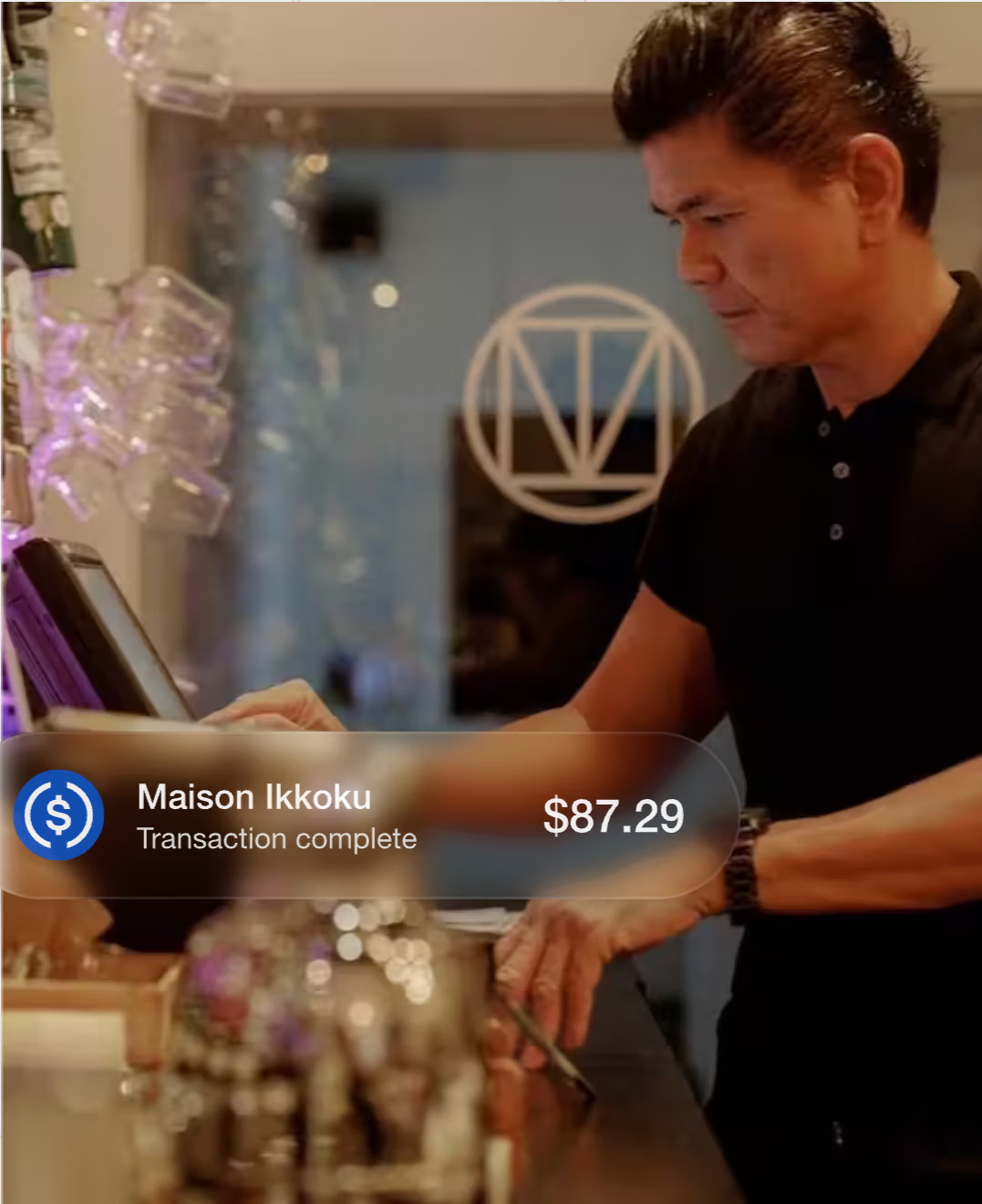
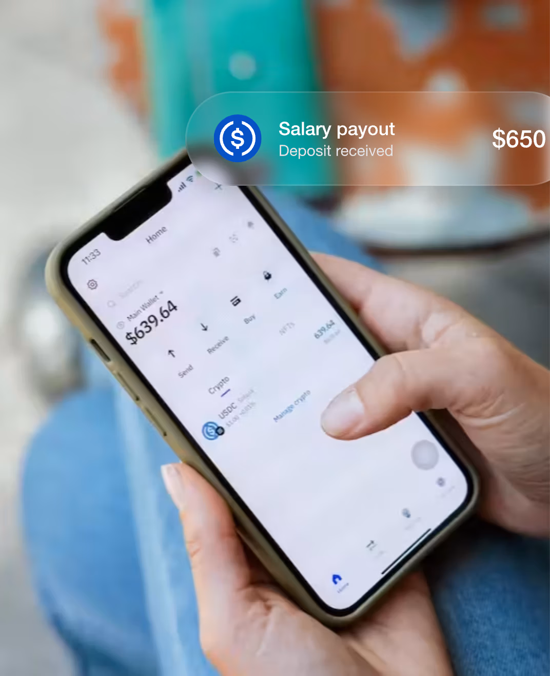
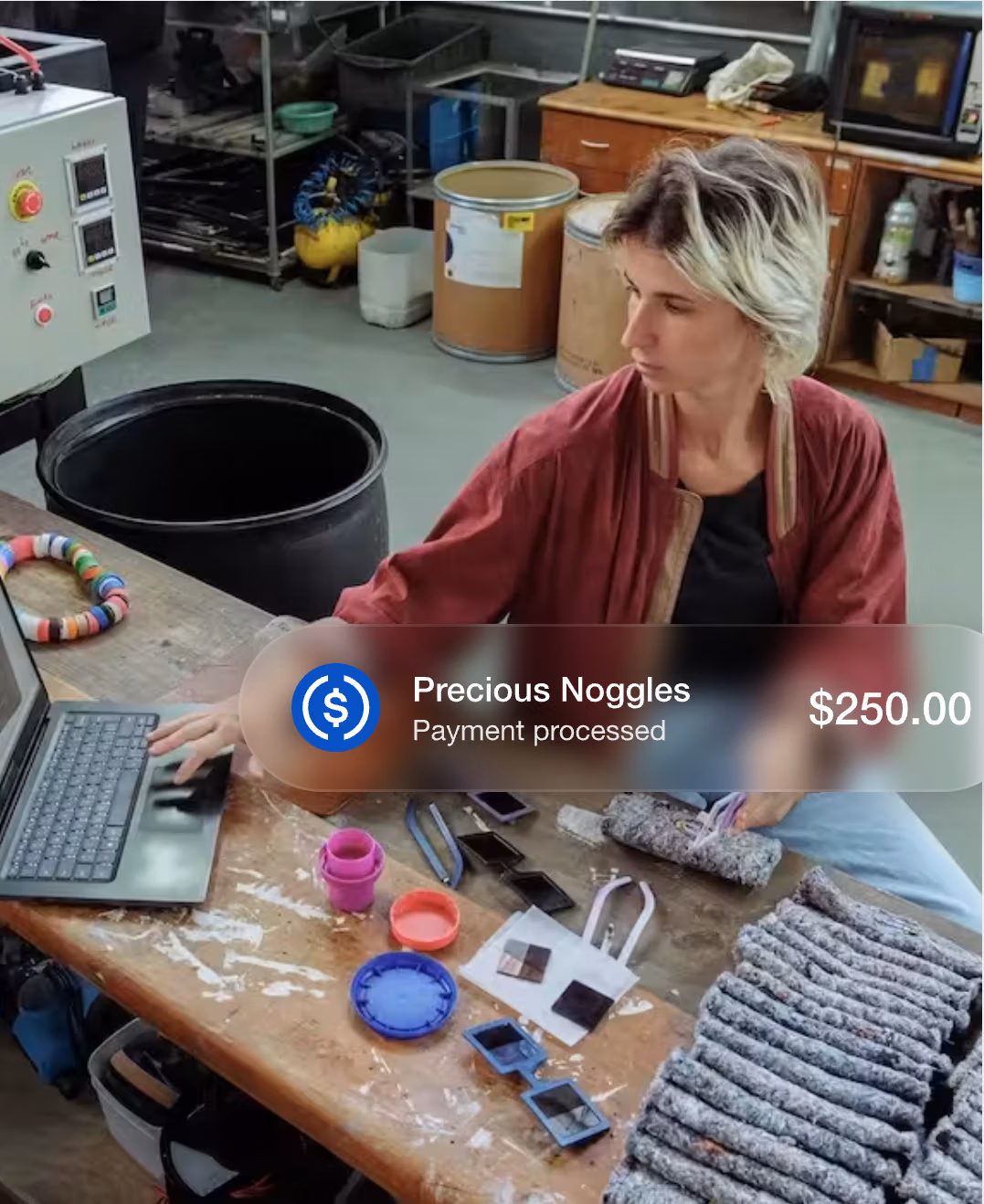
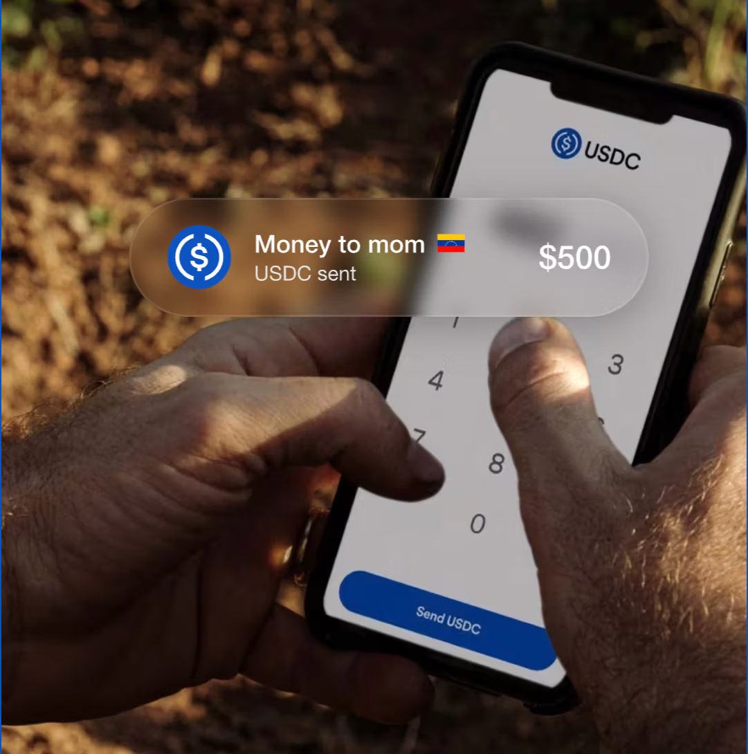
USDC does a great job featuring real people in every visual, which makes the product feel more relatable and helps the audience connect instantly
Design That Signals ‘Legit’, Not ‘Casino’: Layout, Colors and Motion
Use Calm, Structured Design Instead of Visual Noise
Crypto visitors scan defensively. Your layout should feel predictable, readable, and stable.
Use a strict rhythm: repeat the same section pattern (headline → 3–5 bullets or a small card grid). Familiar structure lowers mental effort.
Design for reading, not browsing: keep line length comfortable, use generous line-height, avoid long full-width paragraphs, and don’t rely on tiny captions for key info.
Make “important” visually consistent: one style for proof blocks, one style for explainer blocks, one style for warnings/notes. If everything is emphasized, nothing is.
Limit components: too many chips, badges, sliders, tickers, and floating widgets makes the page feel like a dashboard which is risky for first-time trust.
Prioritize stability: avoid layout jumps, aggressive popups, and elements that shift as they load. “Nothing surprising happens” is a trust signal.
The goal is a page that feels like a well-run service: calm, clear, and steady.
Social Proof That De-Risks the Decision
Testimonials: Use Specific Numbers, Quotes and Logos with Context (bonus: video)
The best crypto testimonials don’t “praise the product.” They answer the scary questions with lived detail.
Use a 4-piece testimonial format:
Who they are (role + context): “Founder, OTC desk” / “Head of Growth, wallet app”
What they tried to solve: “reduce drop-off after KYC” / “increase first deposits”
What changed (with a number): “funded accounts up +18% in 30 days” / “deposit completion from 22% → 31%”
Why they trusted you: one concrete moment: “fees shown before confirm” / “support answered in 10 minutes” / “withdrawal arrived as expected”
Place testimonials where doubt spikes:
Next to onboarding/KYC → proof about speed/clarity
Next to fees → proof about “no surprises”
Next to withdrawals/support → proof about reliability
Video works when it’s structured (15–30s):
1 sentence: who they are
1 sentence: what they feared / what was blocking growth
1 sentence: what result they saw
No music montage, no vague praise—just a clean, human proof clip.
ForumPay showcases strong testimonials: full names, clearly relevant titles, and the company names and logos to back each quote up
Media that give extra credibility
Media mentions work best when they help a cautious visitor answer: “Is this business real, and do serious third parties treat it seriously?”
What to prioritize:
Mentions that explain what you do (so visitors understand your role and model quickly)
Independent reviews or evaluations that visitors can check themselves (with a direct link)
Credible third-party content featuring your team (interviews, talks, webinars) where you explain operations, security, or compliance
Partner references where the partner publicly describes working with you (especially if they clarify scope and responsibilities)
How to present it so it builds trust:
Add a short label for each mention that explains why it matters (“Product walkthrough,” “Compliance overview,” “Independent review,” etc.)
Include the date and a source link
Keep the set small and relevant so it stays easy to scan
ITrustCapital does an excellent job stacking credibility signals: prominent awards and credentials, real user reviews shown directly on the page, and links to trusted third-party review sites (Google and Trustpilot) with 7,000+ five-star reviews—because in this context, volume matters.
Nail the One-Line Promise: What You Do and Who It’s For
Say What You Do in One Clear Sentence
A strong one-liner is a job + differentiator + outcome (in that order):
[Product] for [who] to [do the job], with [one trust-maker], so [outcome].
Keep the trust-maker tangible (something a person can picture happening), for example: clear totals before confirming, predictable steps, visible withdrawal path, self-custody, live support, transparent limits.
Examples:
“A [exchange] for [spot traders] to buy and sell crypto, with clear totals before confirming, so every trade feels predictable.”
“A [wallet] for [self-custody users] to store and send crypto, with keys held on your device, so control stays with you.”
“An [on-ramp] for [first-time buyers] to fund with bank or card, with step-by-step clarity on timing and cost, so funding feels straightforward.”
A [payments platform] for [businesses] to send stablecoin payouts, with simple tracking and receipts, so operations stay clean.
Name Exactly Who Your Platform Is For
Define “who” with three anchors so the right people self-recognize fast:
Use case + experience level + context.
Examples:
“For first-time buyers using bank transfer or card who want a clear path from signup to funding.”
“For active traders who want speed while keeping costs and steps transparent.”
“For businesses making stablecoin transfers that need traceability and predictable flows.”
One rule: don’t try to be for everyone in one line—be specific enough that a reader can immediately say, “That’s for me.”
Robinhood makes its value proposition—and its main differentiator (low fees)—the most prominent element above the fold, then reinforces that message throughout the page.
Bonus: placing the value prop on the right with the hero image on the left maximizes visibility during the first scan.
Bitkey puts its value proposition front and center above the fold, making it the most prominent element on the page.
One Primary CTA: Low-Commitment, Always Within Reach
Pick one main CTA and focus the page around it
Pick one “next step” that matches where the visitor is in their decision journey (most crypto landing-page traffic is still evaluating).
How to choose the primary CTA
If the user must deposit to experience value: choose a CTA that moves toward funding without feeling like a leap (e.g., “Start funding” / “See funding steps” / “Create account”).
If there’s a demo/tour available: “View demo” can be primary (it keeps momentum without forcing commitment).
If sales/contact is required: “Talk to a specialist” works if you keep it short and specific (e.g. “Get answers on fees & withdrawals”).
Then remove CTA competition
One button style dominates (color/size). Everything else becomes a plain link.
If you need secondary actions (docs, pricing, security), treat them as supporting links, not alternatives.
Reduce the perceived commitment (make the first step feel safe)
The first CTA should feel like starting, not signing away control.
Ways to lower perceived commitment without weakening the offer:
Choose labels that imply progress (“Start”, “Preview”, “Check”, “See steps”) rather than finality (“Buy now”, “Deposit now”).
Make the first step naturally reversible: view, explore, estimate, verify, preview.
If a process has multiple steps (account → verification → funding), show it as a short sequence so “Start” doesn’t feel like “Finish.”
Always Within Reach: repeat the CTA at the right moments (without feeling pushy)
Repeating the CTA works when it shows up after the visitor receives a useful answer.
Place CTA repeats at decision points, for example:
after you explain fees/pricing
after you clarify custody/withdrawals
after you show security proof
after a short product walkthrough or User Interface strip
How to repeat without pressure:
Keep the same CTA (same wording), so it feels consistent.
Pair repeats with a small “what happens next” hint (“Next: create account → verify → fund”).
Use a quiet sticky CTA (header or bottom on mobile) only if it doesn’t cover content or interrupt reading.
Dcent makes sure it’s easy for the visitors to take action whenever they feel ready
Form rules: ask only what you need + “we won’t spam you”
Treat the form as part of trust, not just data collection.
Practical rules:
Default to the minimum: only fields needed to start the next step.
Separate “required to start” from “nice to have later.” Collect extras after the first success moment.
Use progressive steps when helpful: step 1 (email) → step 2 (details). People commit more after a small win.
Put the reassurance right under the input (not in the footer):
“No spam. Only account and security updates.” / “Unsubscribe anytime.”
Make errors gentle and specific (what’s wrong + how to fix), and keep the user’s input.
Above the Fold: What a Crypto Prospect Must See in 5 Seconds
Headline: what the product enables in one line (the core job).
One predictability cue: one short line that reduces uncertainty (costs, steps, withdrawal path, or requirements).
One primary CTA: one clear next step.
One supporting visual: a real-looking product view that matches the promise (simple and readable).
Micro-trust cues: a small set of short expectation-setters (e.g., “total shown before confirm,” “clear steps,” “support available”).
One “not ready yet” link: a low-pressure alternative (pricing / how it works / proof).
Mobile sanity check: CTA visible without scroll; no oversized elements push it down; image cropped for readability.
Summ packs the above-the-fold area with reassurance cues to establish credibility immediately—an essential conversion driver in crypto
Storytelling: Your “Why” (Emotional Trust Without Hype)
Why you do what you do (the origin story)
Keep the “why” grounded in a real moment, not a grand mission.
A simple structure that works:
The moment: what you saw happen to users (confusion, anxiety, bad surprises, getting stuck).
The decision: what you chose to build differently.
The outcome: what you want people to feel when they use you (in control, informed, not second-guessing).
Write it as a short block (5–7 lines).
The enemy: what you refuse to be (hidden fees, blocked withdrawals, ghost support)
This isn’t about attacking competitors. It’s about setting a behavioral standard.
Use a “We don’t do X; we do Y instead” pattern:
“We don’t bury important details → we surface them where decisions happen.”
“We don’t rely on vague reassurance → we show specifics people can check.”
“We don’t make the process feel unpredictable → we make each step feel explained.”
Keep it practical. The reader should immediately understand what your product won’t do to them.
The promise: principles you built the product around (and how users feel it)
List 3–5 principles, each with a “how it shows up” line:
Transparency by default → users can understand costs, requirements, and timing without digging.
Predictable paths → users always know what happens next and what might slow it down.
Accountability → real humans, clear channels, and visible ownership of issues.
User control where possible → fewer “black box” moments, more choices explained in plain terms.
End with one sentence that connects emotion to action: “This is what makes someone comfortable taking the first real step.”
Help Visitors Simulate the Experience
Let Them See the Product Before Any Commitment
Static promises are hard to trust in crypto. “Simulation” lowers friction because it answers the practical question: “What will this feel like once I’m inside?”
Give visitors a way to preview the real moments that matter—without creating an account yet:
A “preview deposit/withdraw flow” (screens + steps) so they can see where they’ll end up.
A fee/total-cost preview that mirrors the real confirmation screen (“what you pay” and “what you receive”).
A “what you’ll need” preview for verification (document types, typical steps, common triggers like new device / higher amount), so requirements don’t feel like surprises.
Use Guided Tours, Read-Only Modes and Short Videos
Pick one of these “experience previews” based on what you can ship cleanly:
Guided tour (best default): a clickable walkthrough that highlights 5–7 key elements (deposit, fees, trade, withdraw, settings, support). Add short tooltips that explain what the user is seeing.
Read-only mode (strongest trust builder): a demo environment with fake balances and disabled actions. Visitors can explore menus and screens without risk or signup.
Short video (fastest to deploy): 20–40 seconds, screen-recorded, no hype music. Show one complete loop: open → choose action → see total → confirm screen → where to track it.
Two rules make these previews convert:
Show the “decision screens” (where cost, steps, and confirmations are visible).
End with a calm next step (“Start”, “Create account”, “Talk to us”) instead of pushing a hard commitment.
INX gives visitors a real preview of the platform, making it easier to imagine the experience—and increasing trust before they sign up.
Note: This kind of full trading interface is useful as a credibility preview—but it’s usually not the best page to send first-time visitors to from ads.
Let us Generate Qualified Leads for your Crypto business


